
We’ve been hearing a lot about mobile-first indexing lately, as the latest development in Google’s ever-continuing efforts to make the web more mobile-friendly and reflect user behavior trends.
But there’s also a lot of confusion around what this means for the average business owner. Do you have to change anything? Everything? If your site is mobile-friendly, will that be good enough?
IS THIS GOING TO BE ANOTHER MOBILEGEDDON?!!
In this post I’ll go over the basics of what “mobile-first indexing” means, and what you may need to do about it. I’ll also answer some frequently asked questions about mobile-first indexing and what it means for our SEO efforts.
What is “mobile-first indexing”?
Mobile-first indexing is exactly what it sounds like. It just means that the mobile version of your website becomes the starting point for what Google includes in their index, and the baseline for how they determine rankings. If you monitor crawlbot traffic to your site, you may see an increase in traffic from Smartphone Googlebot, and the cached versions of pages will usually be the mobile version of the page.
It’s called “mobile-first” because it’s not a mobile-only index: for instance, if a site doesn’t have a mobile-friendly version, the desktop site can still be included in the index. But the lack of a mobile-friendly experience could impact negatively on the rankings of that site, and a site with a better mobile experience would potentially receive a rankings boost even for searchers on a desktop.
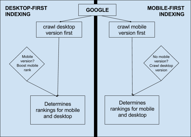
You may also want to think of the phrase “mobile-first” as a reference to the fact that the mobile version will be considered the primary version of your website. So if your mobile and desktop versions are equivalent — for instance if you’ve optimized your content for mobile, and/or if you use responsive design — this change should (in theory) not have any significant impact in terms of your site’s performance in search results.
However it does represent a fundamental reversal in the way Google is thinking about your website content and how to prioritize crawling and indexation. Remember that up until now the desktop site was considered the primary version (similar to a canonical URL) and the mobile site was treated as an “alternate” version for a particular use case. This is why Google encouraged webmasters with a separate mobile site (m.domain.com) to implement switchboard tags (which indicated the existence of a mobile URL version with a special rel=alternate tag). Google might not even make the effort to crawl and cache the mobile versions of all of these pages, as they could simply display that mobile URL to mobile searchers.
This view of the desktop version as the primary one often meant in practice that the desktop site would be prioritized by SEOs and marketing teams and was treated as the most comprehensive version of a website, with full content, structured data markup, hreflang (international tags), the majority of backlinks, etc.; while the mobile version might have lighter content, and/or not include the same level of markup and structure, and almost certainly would not receive the bulk of backlinks and external attention.
What should I do about mobile-first indexing?
The first thing to know is that there’s no need to panic. So far this change is only in the very earliest stages of testing, and is being rolled out very gradually only to websites which Google considers to be “ready” enough for this change to have a minimal impact.
According to Google’s own latest guidance on the topic, if your website is responsive or otherwise identical in its desktop and mobile versions, you may not have to do anything differently (assuming you’re happy with your current rankings!).
That said, even with a totally responsive site, you’ll want to ensure that mobile page speed and load time are prioritized and that images and other (potentially) dynamic elements are optimized correctly for the mobile experience. Note that with mobile-first indexing, content which is collapsed or hidden in tabs, etc. due to space limitations will not be treated differently than visible content (as it may have been previously), since this type of screen real estate management is actually a mobile best practice.
If you have a separate mobile site, you’ll want to check the following:
- Content: make sure your mobile version has all the high-quality, valuable content that exists on your desktop site. This could include text, videos and images. Make sure the formats used on the mobile version are crawlable and indexable (including alt-attributes for images).
- Structured data: you should include the same structured data markup on both the mobile and desktop versions of the site. URLs shown within structured data on mobile pages should be the mobile version of the URL. Avoid adding unnecessary structured data if it isn’t relevant to the specific content of a page.
- Metadata: ensure that titles and meta descriptions are equivalent on both versions of all pages.
- Note that the official guidance says “equivalent” rather than “identical” – you may still want to optimize your mobile titles for shorter character counts, but make sure the same information and relevant keywords are included.
- Hreflang: if you use rel=hreflang for internationalization, your mobile URLs’ hreflang annotations should point to the mobile version of your country or language variants, and desktop URLs should point to the desktop versions.
- Social metadata: OpenGraph tags, Twitter cards and other social metadata should be included on the mobile version as well as the desktop…